-

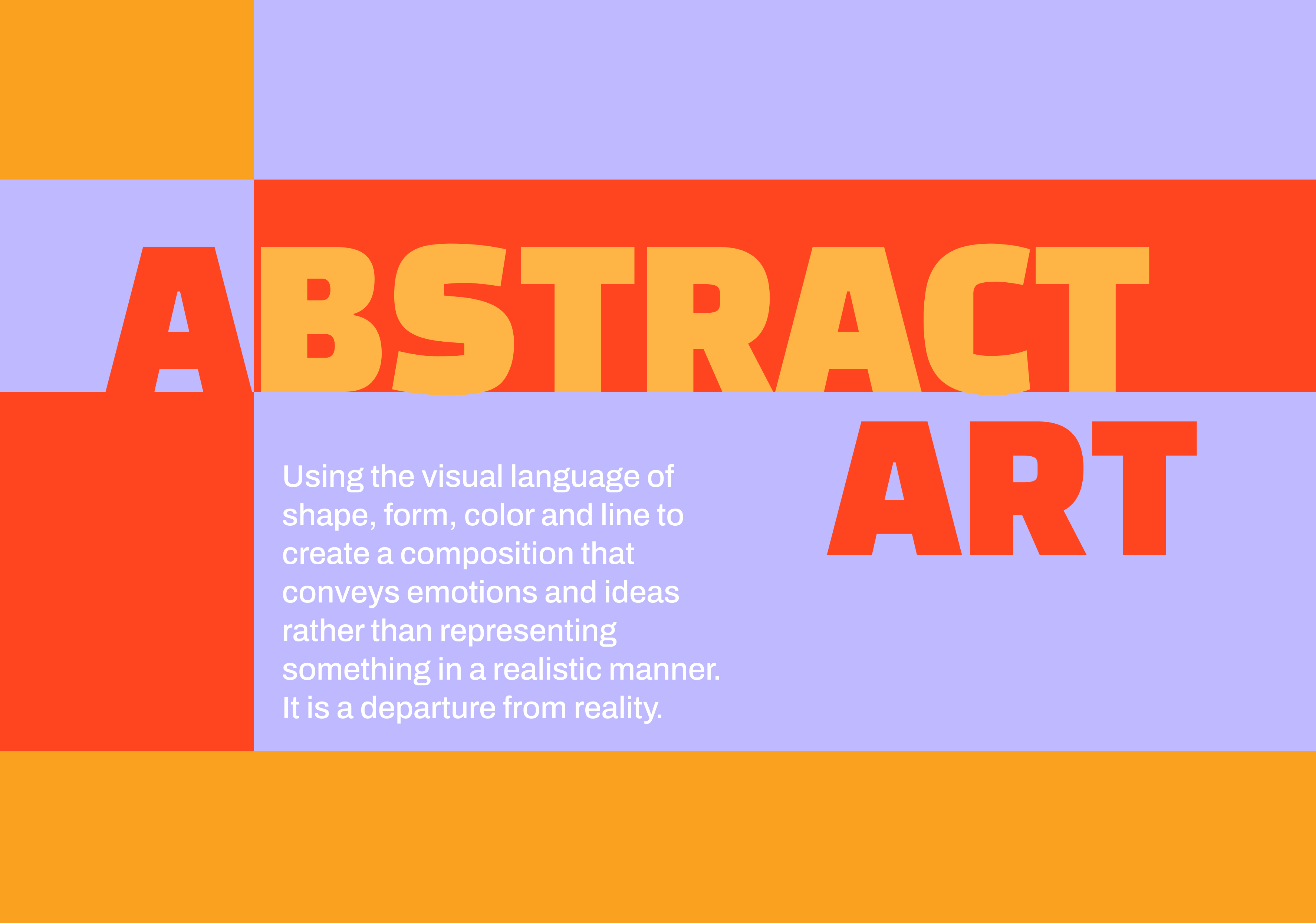
Abstract Art Microsite (Designer)
I was guided by my creative director to create a microsite that reflects the essence of abstraction through geometric shapes, simplicity, and bright, saturated colors. A consistent color scheme of orange, yellow, and purple along with repeated geometric elements ties every page cohesively. The microsite features a minimalistic gallery to highlight artworks.
-

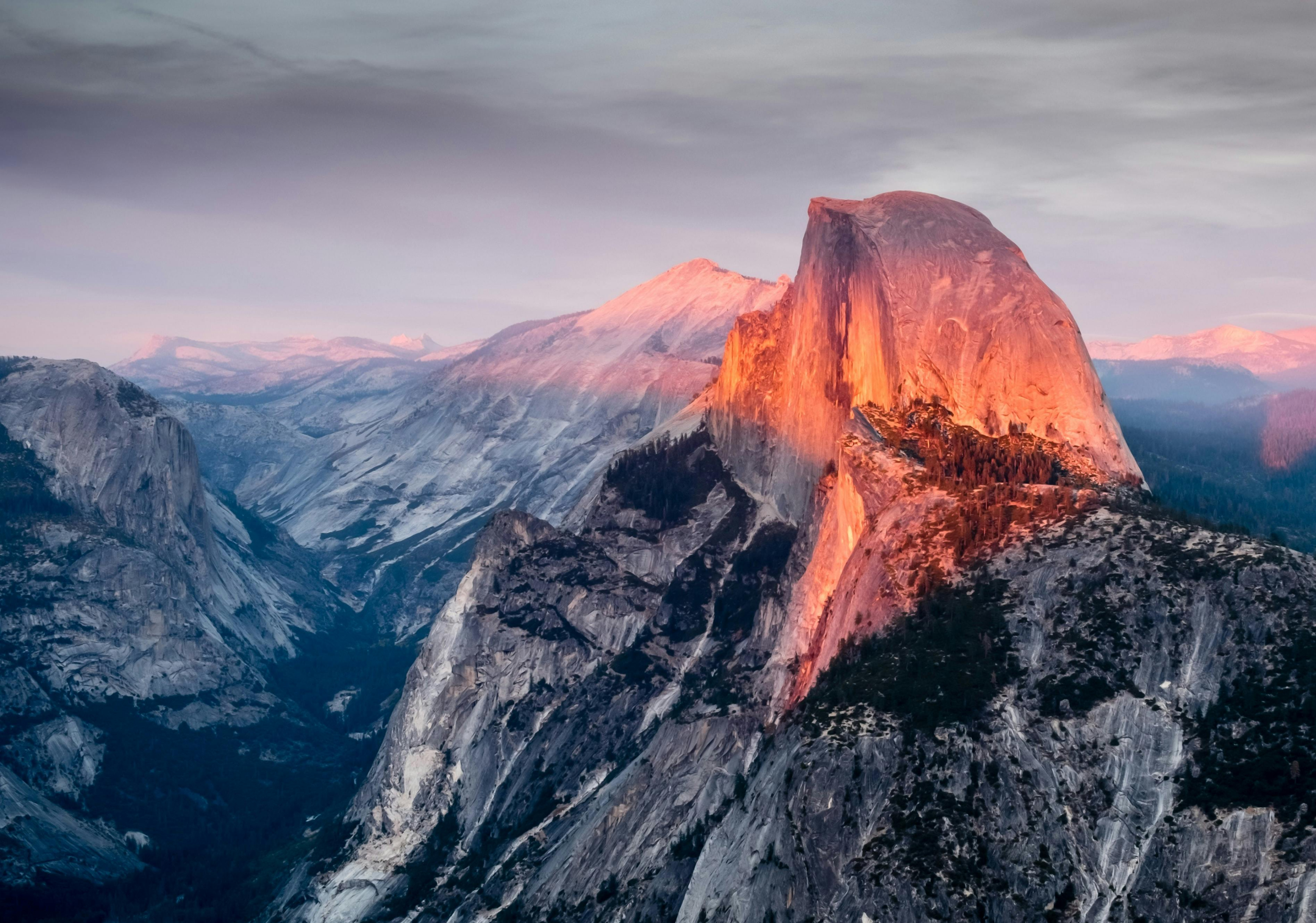
Yosemite Microsite (Creative Director)
I was the creative director for the Yosemite National Park microsite, leading the design vision. I emphasized using large, immersive imagery and a simple translucent navigation bar. For informational pages, I guided the designer to place informational text alongside large visuals to maintain a sense of grandeur throughout the site.
